Signed in as:
filler@godaddy.com
Signed in as:
filler@godaddy.com

The call desk received many user complaints about unclear login errors, complex password requirements, and a confusing interface. My design supported a new visual identity and a clearer user flow for visitors while removing unnecessary obstacles.
Gain a better understanding of best practices of usability and functionality of Login through heuristic and competitive analyses.
Gather requirements to help improve the rate of successful logins by decreasing login errors, customer complaints, and password reset requests for the organization’s website and application.
Determine if the new design will benefit users and make the Login and password reset process easier.
I began the process by interviewing stakeholders to synthesize the vision for the Login page and to gain a better understanding on how it aligns with the overall business goals. Discussions also involved how we could measure success (and failure) of the design.

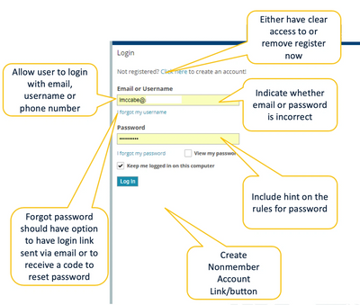
During stakeholder interviews, I obtained documented user feedback via logged user complaints from the company call center. The user complaints revealed the following complaints:
I conducted an analysis of seven competitors and evaluated their strategies to determine the strengths and weaknesses of their Login designs and interface. The analysis revealed that our competitors had a more efficient Login process as well as clearer feedback loops for users attempting to reset their passwords. The analysis revealed the following trends:
The Heuristic analysis revealed the following pain points:
Additionally, the design did not consider current trends and best practices.


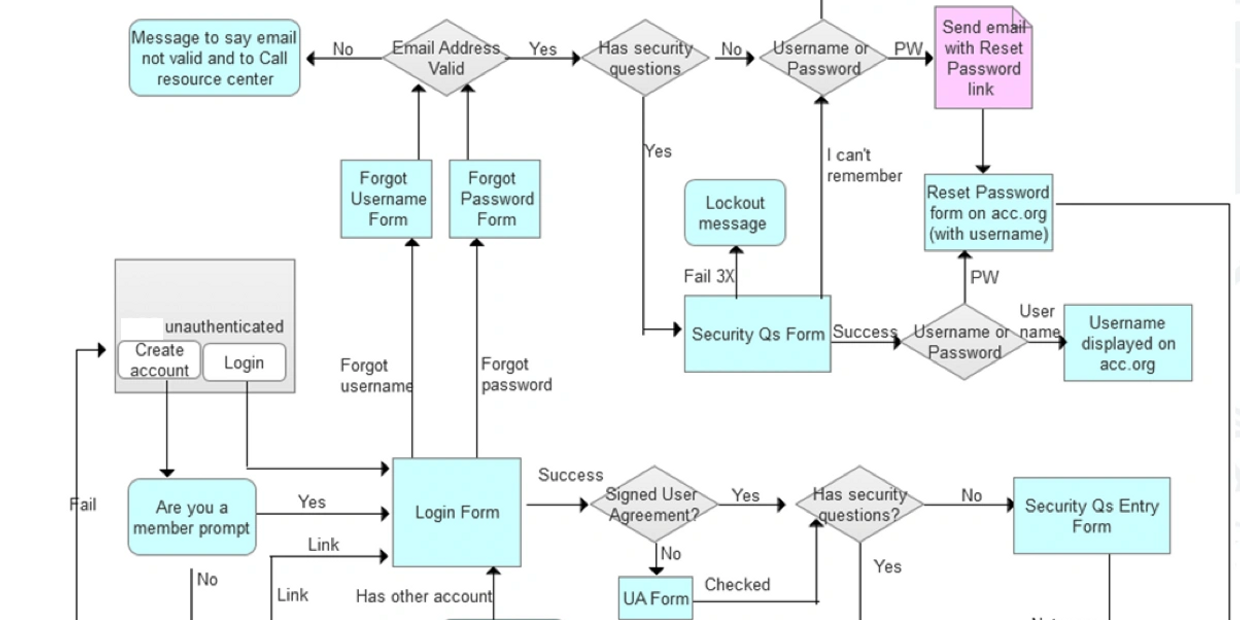
My team and I utilized user flows to help map out the bigger picture for each target user. After determining all possible flows, I then focused on redesigning each potential landing page throughout a user's journey.

I used Balsamiq to virtually draw out and externalize ideas, which could then be shared with the team. Once sketches were discussed and reworked, we touched base with the stakeholders. The sketches allowed us to ask follow-up questions during these meetings that would help clarify in more details. Whether it was allowing the primary stakeholder to express a vision or seeking clarification from the developer - we used sketching to help get us on the same page.
I designed several iterations of approximately 38 wireframes, which were frequently reviewed with my team and the primary stakeholder. Once we came to a consensus in the overall structure, information architecture and flow — we were able to focus on really developing the UI components and copy/content.
An initial draft of the redesign included social media login as an option. The problem here was that we currently did not have the technical capacity to execute such a login due to limitations within our database systems. For the same reasons, we were unable to implement login with SMS. However, I was able to be more flexible and expressive with the error messaging design. I was responsible for overseeing this project and ensuring the final illustrations were in line with our overall vision. It was important that these were clear, concise, and easy. The final illustrations represent a more holistic image with a fresh, clean tone.
Original Design
Original Design

Significantly fewer users called the call center for login and password retrieval assistance.

In a post-launch survey, users reported high satisfaction ratings and positive comments of the redesign.

The primary stakeholder personally congratulated our team on a successful launch. The project's success earned us a new client for future projects.